Client: Fine Woodworking
Project: Publication Design
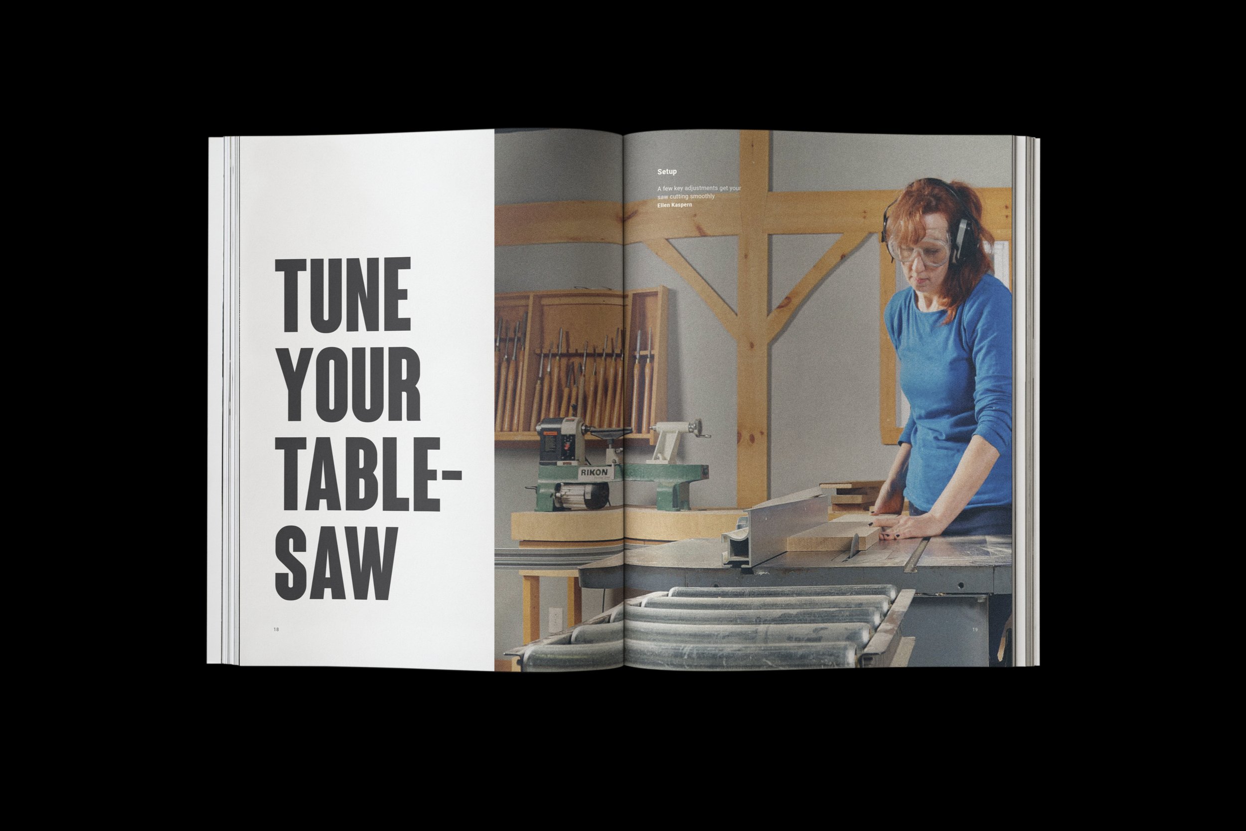
The purpose of Fine Woodworking is function. As a magazine aiming to educate its readers on the best woodworking practices and techniques, the visual language and type systems must communicate simply and plainly. Within this simple design system is an ability for alternate color and design styles to differentiate each issue. Contrast in type size is used for an obvious hierarchy of information. Combining beautiful large photography with annotations and explanations makes for an easy-to-follow guide.
Cover — Old and New

Spreads