
Client: Ken’s Fruit Market
Project: Branding
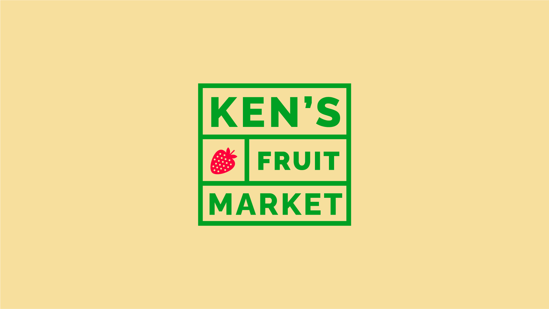
As a Grand Rapids neighborhood grocer, Ken’s Fruit Market is a community mainstay for many. Their core values of family, growth, provision, and community, along with a promise of freshness, quality, seasonality, and affordability create a sense of trust among patrons. It is crucial the visual and verbal brand reflect these same sentiments. Through a simple and reliable design system of vibrant core colors, friendly typography, and beautiful photography, Ken’s values are tastefully communicated.
Logo — Old and New


Logo — Alternates


Grocery Bag/Staff Apparel


In-store Sign System


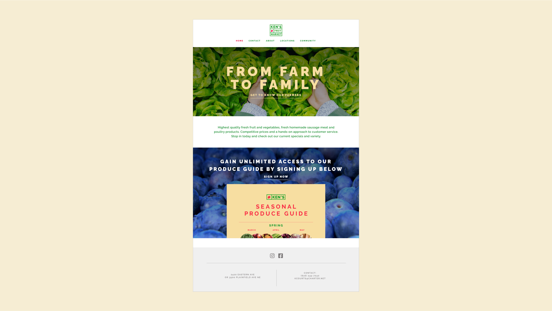
Content Marketing/Produce Guide/Website Homepage


App


